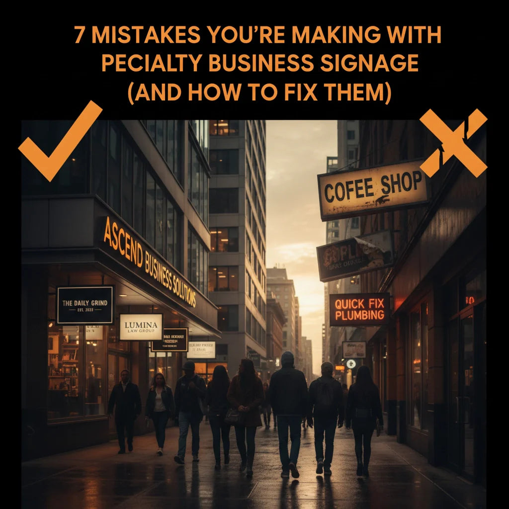
7 Mistakes You're Making with Specialty Business Signage (and How to Fix Them)
You know that feeling when you drive past a business and can't quite figure out what they're selling? Or when you spot a sign that's so cluttered you give up trying to read it before you've even started? We've all been there, and honestly, it's a missed opportunity that breaks our hearts a little bit.
Your business signage is working 24/7 to represent your brand, attract customers, and communicate your message. But here's the thing – even the most well-intentioned business owners can fall into some surprisingly common signage traps. The good news? These mistakes are totally fixable, and we're here to help you avoid them.
At North By North East, we've seen it all over the years, and trust us, you're not alone if you've made some of these blunders. Let's dive into the seven biggest specialty signage mistakes we encounter and, more importantly, how to fix them so your signs can work as hard as you do.
1. Cramming Everything But the Kitchen Sink Onto One Sign
We get it – you're excited about your business and want to tell the world everything you offer. But here's where many of us go wrong: trying to fit our entire service list, contact details, opening hours, and mission statement onto a single sign. The result? A cluttered mess that overwhelms potential customers in the few seconds they have to glance your way.
The Fix: Less really is more when it comes to effective signage. Focus on your core message – typically your business name, what you do in just a few words, and maybe your phone number or website. Everything else can live on secondary signage or your website.
Think of your main sign as a headline, not a novel. If someone driving by can't read and understand your message in 3-5 seconds, it's time to simplify. Trust us, your customers will thank you for making their lives easier.

2. Choosing Fonts That Look Great on Your Computer Screen (But Terrible in Real Life)
Oh, this one hits close to home! We've all fallen in love with a gorgeous, decorative font that looks absolutely stunning on our design software. But when it comes to real-world signage, those fancy fonts can become your worst enemy.
Overly stylized fonts, thin lettering, or fonts that are simply too small create a frustrating experience for your potential customers. If they can't read your sign from a reasonable distance, they're not going to pull over and squint at it – they'll just keep driving.
The Fix: When selecting fonts, always prioritize readability over artistry. Choose bold, clean fonts that remain legible from at least 10-15 feet away. Before finalizing your design, print out a sample and test it from various distances and angles.
Pro tip: Sans-serif fonts typically work better for outdoor signage because they maintain their clarity at distance and in different lighting conditions.
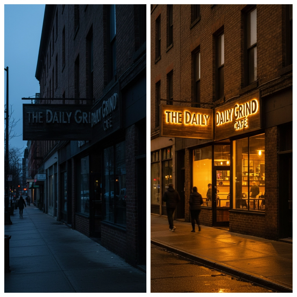
3. Treating Lighting as an Afterthought
Picture this: you've invested in beautiful signage that looks fantastic during the day, but come evening, it disappears into the darkness like a ninja. We see this mistake constantly, and it's such a shame because you're essentially closing your business to evening customers and anyone driving by after dark.
Poor lighting doesn't just affect visibility – it can make your business look closed, unprofessional, or even a bit sketchy. Nobody wants that!
The Fix: Plan your lighting strategy from the beginning, not as an afterthought. LED lighting is your friend here – it's energy-efficient, long-lasting, and provides excellent brightness. Consider backlighting for translucent signs, spotlights for traditional signs, or even halo lighting for a modern, professional look.
For indoor signage in dimly lit areas, proper lighting can transform a barely-visible sign into a focal point that guides customers exactly where you want them to go.
4. Playing Color Roulette (And Usually Losing)
Colors can make your sign pop or make it practically invisible – there's very little middle ground. We've seen gorgeous signs that are completely ineffective because the color combinations just don't work in the real world.
Low contrast between text and background, colors that clash horribly, or muted tones that blend into your building can turn even the most well-designed sign into expensive wallpaper.
The Fix: High contrast is your best friend. Think dark text on light backgrounds or vice versa. Colors like black on white, white on dark blue, or yellow on black create excellent readability.
Consider your sign's environment too. If your building is red brick, a red sign will disappear. If you're surrounded by greenery, avoid green signage. Test your color combinations in different lighting conditions – what looks great in bright sunlight might be invisible on a cloudy day.
5. Ignoring Your Brand Identity (Or Not Having One)
This one makes us a bit sad because it represents such a missed opportunity. Your signage should be an extension of your brand, but we often see signs that look like they belong to completely different businesses when compared to the company's website, business cards, or other marketing materials.
Inconsistent branding confuses customers and dilutes your professional image. It's like wearing a suit jacket with shorts – technically covered, but sending mixed messages.
The Fix: Develop clear brand guidelines and stick to them across all touchpoints. Your signage should use the same colors, fonts, and logo as your website, business cards, and other marketing materials.
If you don't have established brand guidelines yet, your signage project is the perfect opportunity to create them. Choose colors and fonts that reflect your business personality – professional and trustworthy, creative and fun, or modern and innovative – then use these consistently everywhere.

6. Choosing Materials Like You're Shopping for a Bargain Basement Deal
We totally understand the temptation to save money on materials – budgets are real, and every penny counts when you're running a business. But choosing inappropriate materials for your environment is like buying a chocolate teapot – it might look good initially, but it won't last where you need it most.
Signs made from materials that can't handle your local weather conditions will fade, warp, crack, or deteriorate quickly. That "bargain" becomes expensive when you need to replace it in a year instead of enjoying it for five or ten years.
The Fix: Match your materials to your environment. For outdoor signage, invest in weather-resistant materials with UV protection. Aluminum composite panels, high-quality vinyl, and properly treated wood can all work well in different situations.
For health and safety signage or high-traffic areas, durability is even more critical. Don't skimp on quality – view it as an investment in your business's professional image.
Consider the total cost of ownership, not just the upfront price. A slightly more expensive sign that lasts twice as long is actually the more economical choice.
7. Installing Your Sign and Forgetting It Exists
Here's a mistake that sneaks up on everyone: treating your signage like a "set it and forget it" investment. Even the highest-quality signs need some TLC to keep performing their best.
Weather, pollution, and general wear and tear gradually degrade even the best signage. We've seen businesses with faded, dirty, or damaged signs that actively hurt their professional image. It's heartbreaking because often a simple cleaning or minor repair would solve the problem.
The Fix: Create a maintenance schedule and stick to it. Inspect your signage quarterly for damage, fading, or wear. Clean it regularly – you'd be amazed how much difference a good cleaning can make.
Address small problems before they become big ones. A loose mounting bracket is much cheaper to fix than replacing an entire sign that fell and broke. Budget for maintenance and eventual replacement so you're not caught off guard.

Moving Forward with Confidence
The beautiful thing about signage mistakes is that they're all fixable, and now that you know what to look out for, you're already ahead of the game. Whether you're planning new signage or evaluating your existing signs, these guidelines will help you create something that truly works for your business.
Remember, effective signage isn't about having the fanciest design or the biggest budget – it's about clear communication, smart choices, and consistent maintenance. Your signs should make it easy for customers to find you, understand what you offer, and feel confident about choosing your business.
If you're feeling a bit overwhelmed by all of this, don't worry – that's completely normal! Creating effective signage involves balancing multiple factors, and it's okay to ask for help. At North By North East, we love helping businesses get their signage right, whether you need guidance on materials, design advice, or a complete signage solution.
Your business deserves signage that works as hard as you do. With these common mistakes in your rearview mirror, you're well on your way to signs that attract customers, communicate clearly, and represent your brand beautifully.
Ready to fix these mistakes or create new signage that gets it right from the start? We'd love to help you make it happen. After all, there's nothing quite like seeing a business owner's face light up when they see their new signage in place, working perfectly to attract the customers they deserve.